Tag Archives: packaging

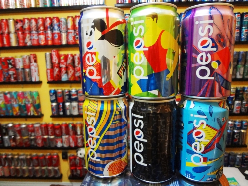
Pop Element: Colourful Pepsi


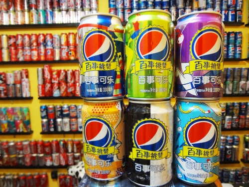
Unique and Colourful Pepsi can designs from China.

I like Pepsi cans from overseas, particularly Asia and Middle East. They seem to depart from the traditional simple blue packaging; almost unrestrained and free to play around with different colours and design elements.

Pepsi China 2015 Pepsi China 2015 2

– Ryan RFT

Leave a comment

Filed under branding

Coca-Cola is Seeing Red and Merry…Holidays!


It’s the most wonderful time of the year. However, a while back at the beginning of November, I made a post regarding potential confusion over the new white Coke cans. Well apparently Coca-Cola recently announced that they would be switching the WWF polar bear cans to red (the colour well-assoicated with the brand) after many consumers picking up and opening the white can thinking it was the diet variation of the soft drink.

As you can see below, this season’s Hong Kong Coca-Cola can went straight to the red polar bear packaging:

Hong Kong can – Merry Christmas

Interestingly, the graphics on the package remain similar to North America’s white polar bear cans promoting the World Wildlife Fund. However, the red cans from HK don’t state anything about WWF or the arctic. Instead, they read ‘Merry Christmas’. It goes to show how Coca-Cola has used polar bears in their holiday campaigns so effectively that the identical graphic elements can conveniently be used for different efforts; 1) for the animal organization’s arctic conservation in one part of the world and 2) for Christmas packaging on the other side of the world.

Merry….umm…Holidays!

Recent Coca-Cola holiday packaging in North America have leaned towards using the term ‘Holiday’ instead of ‘Christmas’:

Holiday 2007! Which holiday? I guess all of them!

Perhaps, this is a way to appeal to all people celebrating different holidays. With Canada and USA being home to citizens from a variety of cultures, this is a safe way to avoid excluding any groups. I believe NBA star Michael Jordan once said, the reason he never openly supported or endorsed a politician was because he did not want to affect his shoe sales. He figured supporters of the opposing group would stop purchasing his products.

So, the Coke cans are back to red (as they have been forever). As someone who engages in art and drawing, I personally like the unique look of white polar bear cans, but from a business/marketing point, they should always be dominantly red. With thats said, Merry Christmas, Happy Hanukkah, Happy Kwanzaa, Happy Holidays, and Happy Boxing Day!

** Boxing Day is a holiday in Canada but has nothing to do with punching other people in the face. It’s a little like our version of Black Friday, where a lot of shoppers fill up every retail store and go crazy over deals. So maybe during the chaos, people actually do get punched in the face.

8 Comments

Filed under branding

White Coca-Cola Cans = WWF Champion


Does anyone else still associate the acronym WWF with professional wrestling? Actually, Coca-Cola cans have turned from red to white for a campaign with the World Wildlife Fund regarding the protection and conservation of polar bears’ Arctic home (Business Wire). In addition to helping raise awareness, the 18 can box states that Coca-Cola will donate $2 million by 2016 to WWF.

While Coca-Cola essentially “owns” the colour red in beverage packaging, this design shows a rarity of stepping away from their familar colour for the regular version of the drink. In fact, it may be possible that this can could initially lead to confusion on the flavour/variation as the dominantly white packaging is similar to the colour commonly associated with diet sodas.

WWF = World Wildlife Fund. WWE = wrestling. Now you know.

Similarly, I recall people confusing the all gold Coke cans from the Vancouver Games as caffeine-free, as gold is used by Coke, Pepsi, and even Dr Pepper to communicate that variation of their drink. However, during the winter months, as these new polar bear cans fill up grocery stores, food outlets and convenience stores, consumers will gradually accept them as this year’s winter packaging. Here, the clean white can is represents the idea snow and the visuals of polar bears is associated to Coke’s past holiday packaging for many years.

Personally, I like this white polar bear design for regular Coke as it is unique. Amusingly, the local store carrying them still has the summer Coke packaging on the shelves. The seasons in Canada change rapidly!

– RFT

4 Comments

Filed under branding

Curves of Coca-Cola!


The importance of package design in marketing is discussed in CNBC’s documentary Coca-Cola: The Real Story Behind the Real Thing. Here, Coke’s 2-litre bottle shape is adjusted to appear more curvaceous. The soda company’s representatives explain that these details to the shape have a ‘magical look and feel’ and have actually led to an increase in sales. The detail is subtle but demonstrates enough visual elegance to stand out in consumers’ minds. Take a look below to compare:

2L bottles of Coke and Pepsi side by side (like best friends)

Coke and its curves!

Straight up Pepsi bottle yo!

 – RFT

Leave a comment

Filed under branding

It’s a New Year! – What’s Next…for Pepsi?


Happy New Year everyone! It seems Pepsi is getting close to already releasing something new in the early stages of 2011.

As shown above, it is called Pepsi Next. It’s a very elegant looking can. It looks fresh, new and fits the Pepsi brand perfectly with its clean design. The different shades of blue and the use of the angles add interest to the design in a modern fashion. Apparently, it’s still in the test market phases but a product description states that it will be the

“first soda to successfully bring together deliciously refreshing cola taste with less of the ingredients that you are trying to avoid.”

This is due to the fact that

“Pepsi experts finally discovered the perfect blend of ingredients,” for, “a newer, more health oriented generation.”

The image of the can shows it has 60 calories – less than what the regular cola contains. Perhaps, it will also have a different sugar/corn syrup formula?

The name ‘Next’ itself suggests moving forward and a sense of positivity. Also, where “diet” soft drinks may appeal to females and other energy drinks or Pepsi ‘Max’ are targeted to men, ‘Next’ can suggest that it is for all adults.

And it seems Pepsi officially calls it “soda” too but as far as I’m concerned, this is one “pop” can I’d like to get my hands on – if it ever reaches store shelves!

1 Comment

Filed under branding

Deck the Halls with…Cans of Pepsi!


Some Santa Coke cans we see every year.

We’ve all seen them – Christmas themed Coca Cola cans. The brand’s classic red colour fits with the holiday theme…and of course, the fact that Coke pretty much created the image of the fat man in red, as we know him today ensures that special packaging will be distributed every holiday season.

However, why can’t Pepsi get in on the fun? In the past, Pepsi has released Christmas cans featuring winter images like a snowman, reindeer and penguins. They even tried their own version Mr. Claus that looked very amateur at best. It must’ve been tough incorporating the image of Santa in a way that doesn’t totally rip off Coke’s creation while at the same time sticking to imagery that is familiar to society.

We know that Pepsi has since moved away from all that clip art style packaging and is now going for a more clean and modern look (as seen in the current Pepsi Lime packaging). So, here are some ideas I put together.

Some old school Winter Holiday themed Pepsi cans – that’s Santa on the top left…I think?

We know that Pepsi has since moved away from all that clip art style packaging and is now going for a more clean and modern look (as seen in the current Pepsi Lime packaging). So, here are some ideas I put together.

Pepsi – Jolly

diet Pepsi – Ho Ho (Ho)?

It is based on past special releases Pepsi put out for St. Valentine’s Day (LOVE, XOXO) and Halloween (BOO). Here, the designs stayed clean and simple and used the new round Pepsi logo in place for the letter ‘O’ in the themed words used.

The Christmas words that I could come up with were ‘JOLLY’ and ‘HO HO HO’. Unfortunately, for the diet Pepsi design, having six characters in the phrase crammed everything up so it is left as ‘HO HO’. Hopefully, the basic message comes across (?). Perhaps, if cans are stacked up on each other, it will communicate the popular saying more clearly. Are there any other short Christmas words that contain the letter ‘O’? Let me know!

Happy Holidays!

rft3 – the Pop Element blog

1 Comment

Filed under branding